


BRAND IDENTITY
LOCAL Surfboard co
DESCRIPTION: Local Surfboard Co is a custom surfboard company located in southern California that caters to the local surfer who likes to break the rules. As a company, their mission is to create quality surfboards that are elite in comparison to the competition.
For the logomark, the fin shape refers to surfboard fins as well as the top predators of the ocean—sharks. The color yellow also sets itself apart from competitors in the surf industry and it matches the “locals only” sign that my brother used to have in his childhood room.
The brand identity reflects the energy of surfing culture with the use of yellow and expressive typography. Since Locals is an exclusive brand, the phrase: “Don’t be a kook. Be a local.” would also resonate with a more seasoned surfer (the target consumer). It’s an honest company—one that caters to the local surfer, not a poser.
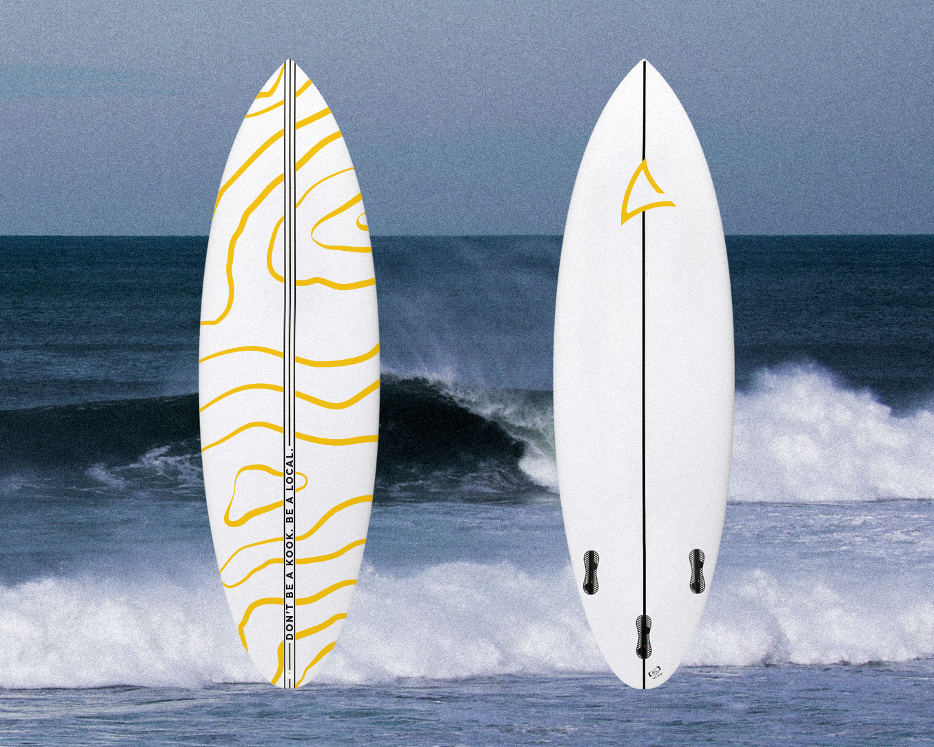
Board Design

Board Stickers
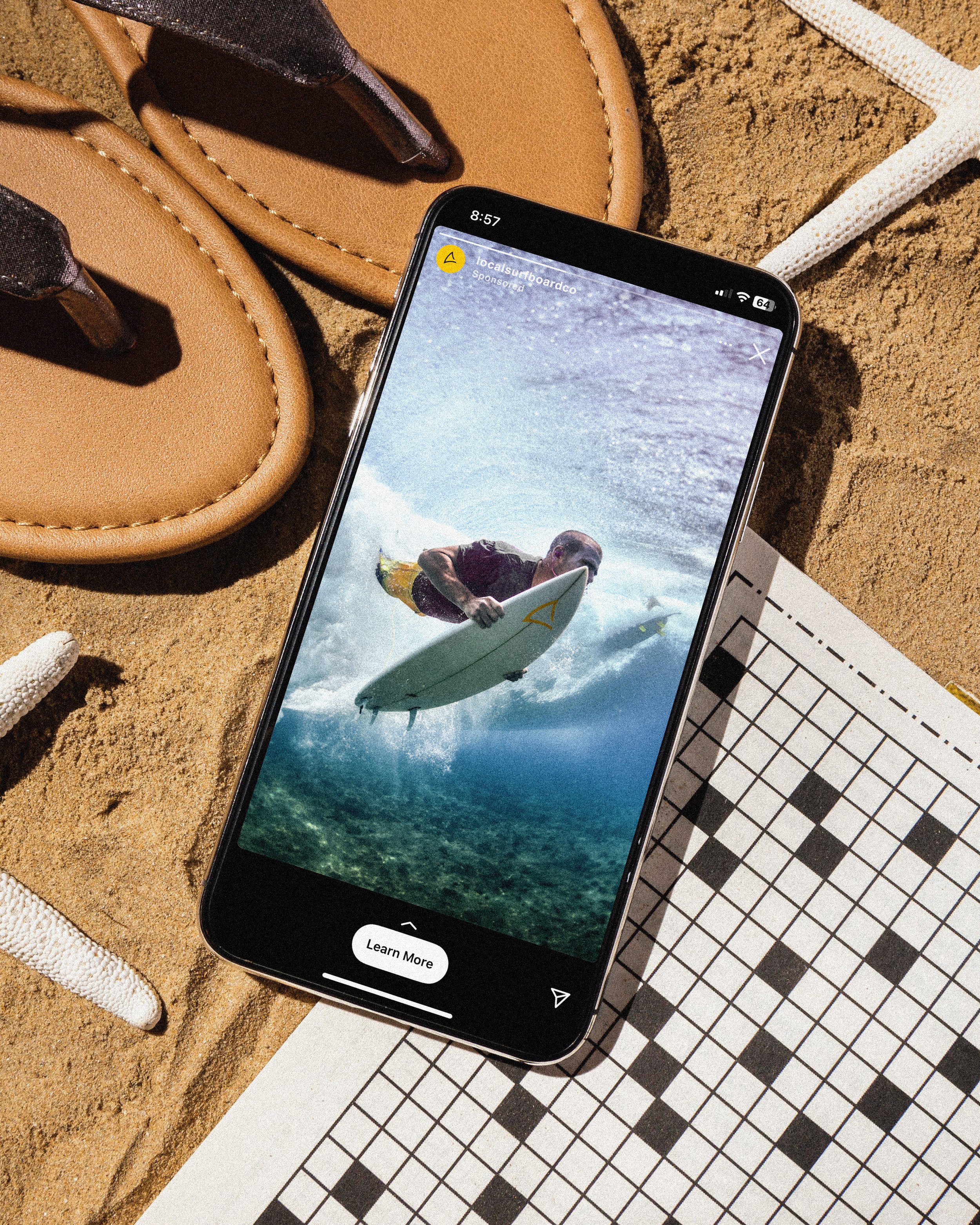
Social Post
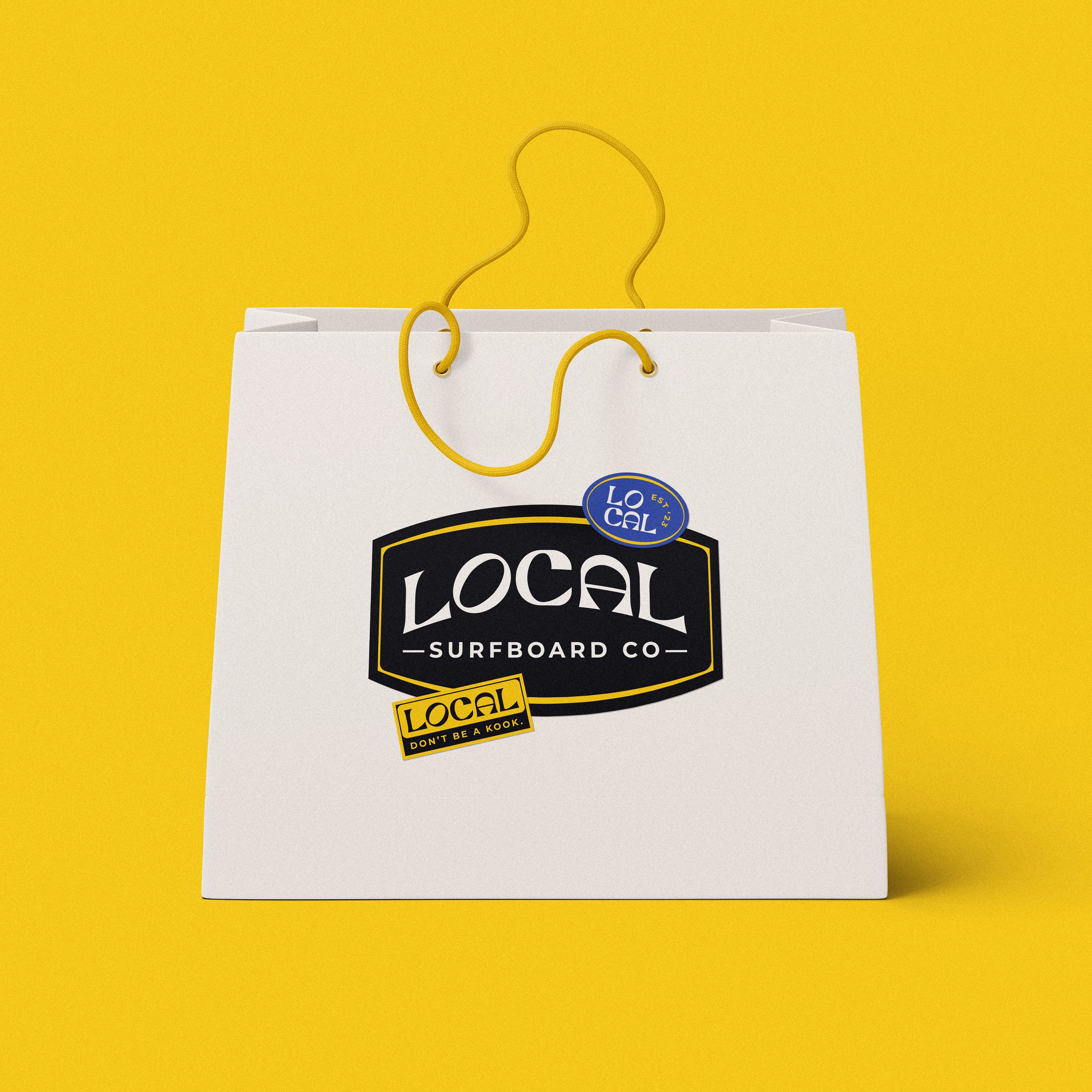
Shopping Bag

Storefront

Wall Signage

Soy Candle

Apparel

Hat
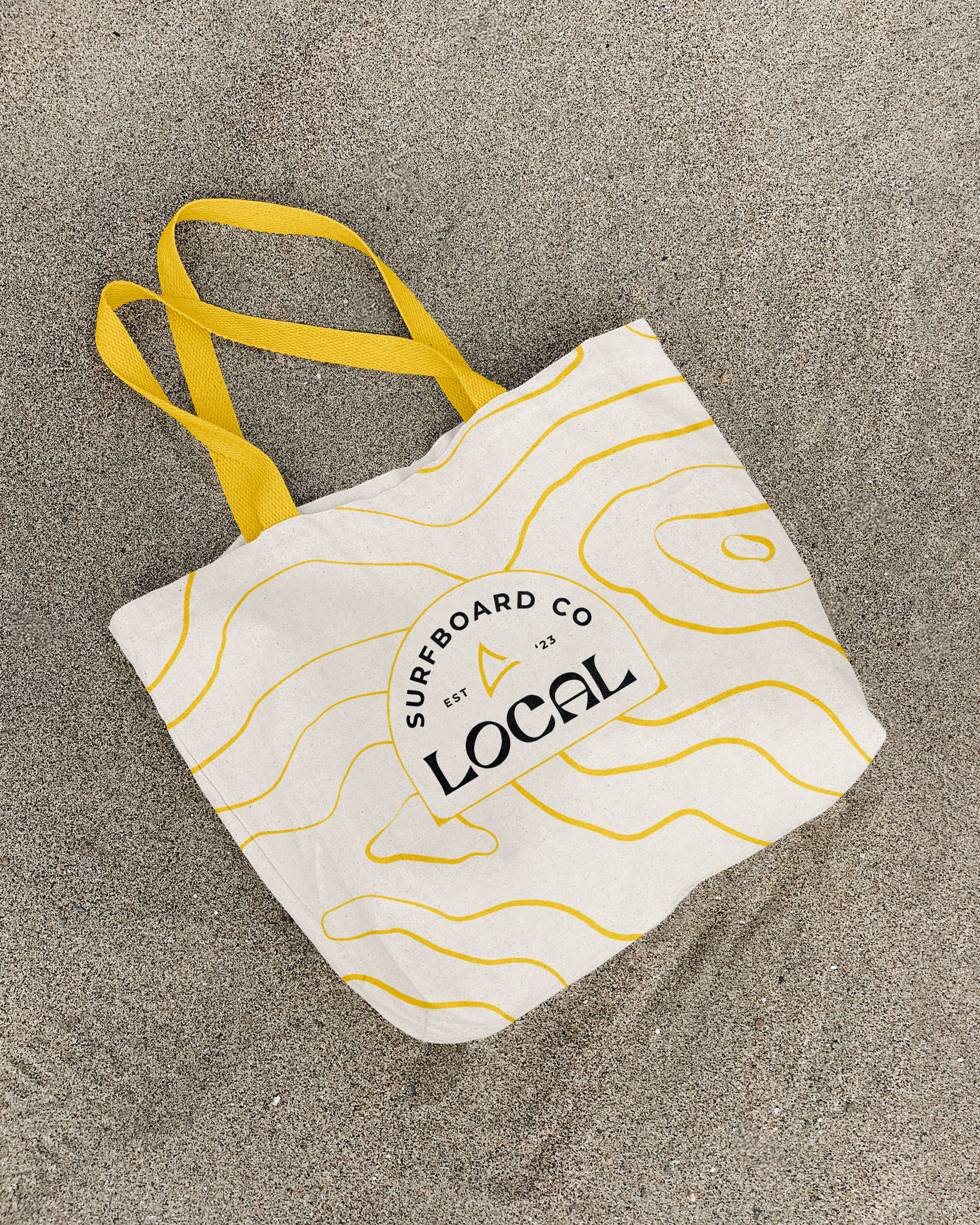
Tote Bag